

File Preparation tips
From Screen to Surface: The Ultimate File Preparation Tips for Flawless Printing There is a specific kind of excitement that comes with clicking “Order” on a new set of business cards or a massive storefront poster. But for many business owners, that excitement is tinged with a bit of anxiety: “Will it look like it
From Screen to Surface: The Ultimate File Preparation Tips for Flawless Printing
There is a specific kind of excitement that comes with clicking “Order” on a new set of business cards or a massive storefront poster. But for many business owners, that excitement is tinged with a bit of anxiety: “Will it look like it does on my screen?”
At Westbury Inks, we believe that the difference between a “good” print and a “stunning” print happens long before the ink hits the paper. It happens in the design phase. Whether you are a seasoned designer using the Adobe Creative Suite or a small business owner utilising Canva, following these file preparation tips is the only way to guarantee professional results.
The Technical Requirements
Before we even look at the design, your file must meet three foundational standards. If these technical file preparation tips aren’t followed, the finest printing press in the world can’t save the final product.
High Resolution (The 300 DPI Rule)
Digital screens only require 72 DPI (dots per inch) to look sharp. Printing, however, requires 300 DPI. If you pull an image off a website and try to print it on a large format poster, it will appear “pixelated” or blurry. Always check your image properties; if your file is 300 DPI at the size you want it printed, you’re golden.
CMYK Color Mode
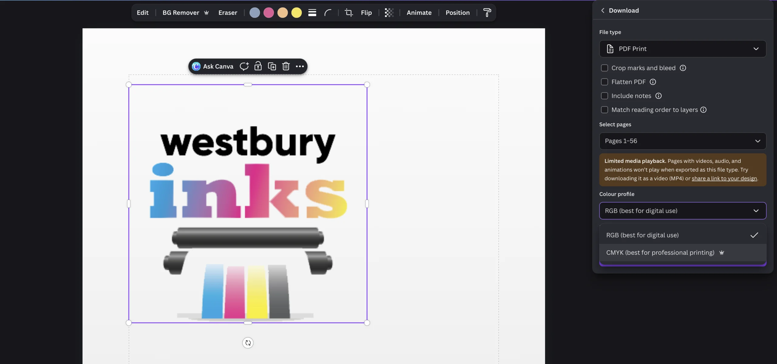
Your screen creates colour by mixing light (RGB). Our presses create colour by mixing ink (CMYK). Many vibrant blues and “neon” greens visible on a screen are physically impossible to replicate with ink. One of our most vital file preparation tips is to set your document color mode to CMYK at the start to get a realistic preview of how your colours will actually land on the page.
The 3mm Bleed & Safety Zone
As discussed in our previous guide on The 3mm Bleed Rule, you must extend your background 3mm past the edge. Equally important is the Safety Zone—keep your text at least 5mm away from the edge to ensure it doesn’t look “cramped” after trimming.
Platform-Specific Tips: Photoshop vs. Canva
Not all design software is created equal. How you export your file depends heavily on the tool you are using, which is why specialised file preparation tips for each platform are so important.
Adobe Photoshop: Managing Layers and Rasterisation
Photoshop is a “raster-based” tool, meaning it treats everything as pixels. Keep your layers intact until you are 100% finished, and ensure your text layers are set to “Sharp” or “Crisp” in the character panel to avoid fuzzy edges. For a deep dive into advanced prep, Adobe’s Photoshop Print Guide offers excellent technical breakdowns for colour profiles.
Canva: The “Pro” Export Settings
Canva is fantastic for accessibility, but its default “Download” settings are often optimised for web, not print. Never send a “Standard PDF” to a printer. Instead, follow these file preparation tips: choose PDF Print, and ensure you check the boxes for “Crop marks and bleed” and “Flatten PDF.” You can learn more about Canva’s Print Settings to ensure your elements aren’t compressed during the download.
Product-Specific Considerations
Different products require different finesse. A business card is held 6 inches from the eye, while a poster is viewed from 6 feet away.
Business Cards: Sharpness is King
Because business cards are small, any error is magnified. We recommend converting all text to “outlines” or “shapes” if possible. This prevents “font substitution” errors where our computer might replace your fancy font with something generic like Arial because a file link was broken.
Large Format Posters: Distance Matters
For massive posters, you can sometimes get away with 150-200 DPI because the viewing distance is greater. However, if the poster features fine print or technical diagrams, stick to the 300 DPI rule. If you are unsure about standard sizing, the ISO 216 International Paper Standard provides the exact dimensions for A-series paper to help you scale your designs correctly.
The Final Quality Check
Before you send that email or upload that file to the Westbury Inks portal, run through these essential file preparation tips as a final mental check:
- Format: Is it a High-Quality Print PDF? We prefer PDFs over JPEGs for clarity.
- Bleed: Is there 3mm of extra background on all sides?
- Colour: Is the file in CMYK mode?
- Fonts: Are the fonts embedded or converted to outlines?
- Images: Are all images at least 300 DPI?
- Spellcheck: Did you have a second pair of eyes look at the phone number and website URL? The one thing we can’t fix is a typo!
Why Choose Westbury Inks?
We aren’t just an automated “upload and pray” service. Our team manually reviews files to catch glaring errors before they become expensive mistakes. If you’re ever unsure about your file setup or need more file preparation tips, check out our Technical Resource Hub or give us a call. We’d much rather spend five minutes helping you fix a file than see you disappointed with a finished product.
Ready to see your design come to life?


